HTML5テクニカルノート
React + TypeScript: FullCalendarのReactコンポーネントを使う
- ID: FN2107001
- Technique: ECMAScript 2015
- Package: React 17.0.2 / TypeScript 4.3
FullCalendarは、さまざまにカスタマイズしたカレンダーがつくれるオープンソースのJavaScriptライブラリです。ReactやVueそしてAngularといったフレームワークにも対応しています。とくに、Reactについては、バーチャルDOMノードを生成するという踏み込んだつくり込みです。
とはいえ、まだReactを用いた情報があまりなく、TypeScriptまで含めると、公式サイトを含めても調べるのに苦労するのが現状です。本稿では数少ない公式情報「React Component」に沿って、改めて解説を書き起こしました。公式のサンプルで用いられているクラスは、今主流となりつつある関数コンポーネントに改め、TypeScriptの型づけを加えています。また、公式の説明は、各項目のコードが抜書きで、そのままでは動きが確かめられません。これも、チュートリアルのようにコードに手を加えてゆくかたちにし、サンプルも掲げることで試しやすくしました。
01 React + TypeScriptのひな形作成とFullCalendarのインストール
Reactアプリケーションのひな型は、Create React Appを使うのが簡単です(「Create React App 入門 01: 3×3マスのゲーム盤をつくる」01「Reactアプリケーションのひな形をつくる」参照)。npx create-react-appコマンドのオプションに--template typescriptを加えれば、プロジェクトがTypeScriptの設定でつくられます(プロジェクト名はreact-typescript-fullcalendar-componentとしました)。
npx create-react-app react-typescript-fullcalendar-component --template typescript
つぎに、プロジェクトのディレクトリ(react-typescript-fullcalendar-component)に切り替えて、FullCalendar(@fullcalendar/react)のインストールです。カレンダーのビューに使うプラグインの@fullcalendar/daygridも加えてください(「Docs / Plugin Index」参照)。
npm install --save @fullcalendar/react @fullcalendar/daygrid
なお、インストールにはyarnを使っても構いません。
yarn add @fullcalendar/react @fullcalendar/daygrid
02 カレンダーを表示する
importはFullCalendar(@fullcalendar/react)を先に、プラグインのdayGridPlugin(@fullcalendar/daygrid)はあとから読み込んでください。FullCalendarコンポーネントのpluginsにプラグインを配列要素として加えます。デフォルト表示のinitialViewは、標準的な月単位のカレンダーdayGridMonthです(「Docs / Month View」参照)。
src/App.test.tsximport FullCalendar from '@fullcalendar/react'; import dayGridPlugin from '@fullcalendar/daygrid'; // プラグインの読み込みは後 function App() { return ( <FullCalendar plugins={[dayGridPlugin]} initialView="dayGridMonth" /> ); } export default App;
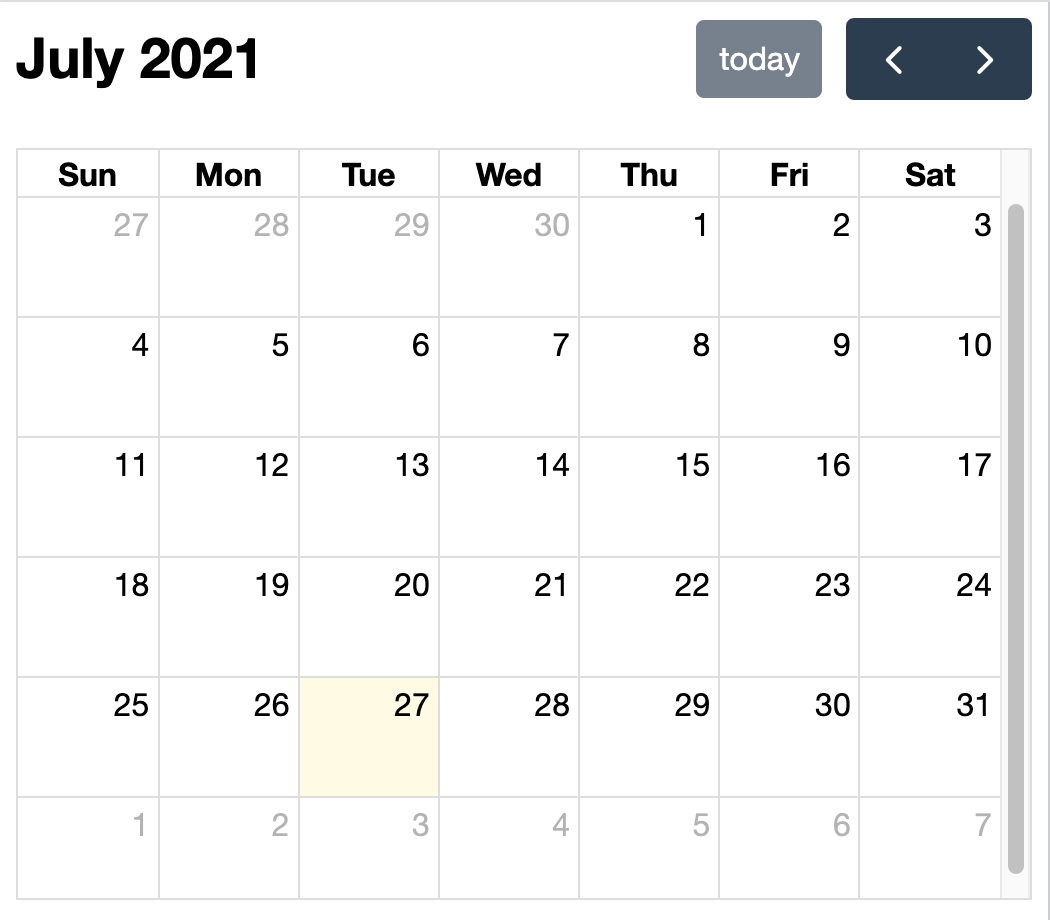
これで、月単位のカレンダーが表示されます(図001)。
図001■月単位のカレンダー
03 プロパティを定める
FullCalendarコンポーネントには、オプションをプロパティとして加えます。試すのは、下表001のオプションです。localeを定めるには、プラグイン@fullcalendar/coreをインストールしてimportしたうえで、localesに与えなければなりません(「locale」参照)。
npm install --save @fullcalendar/core
yarn add @fullcalendar/core
表001■FullCalendarコンポーネントに使ってみるオプション
| オプション | 説明 |
weekends |
週末(土日)を表示するかどうかの真偽値。デフォルト値はtrue。
|
events |
予定を表すイベントオブジェクトの配列。 |
locales |
ロケール実装のためのプラグインを設定。 |
locale |
ロケールの初期値を示す文字列。 |
eventsの配列に収めるイベントオブジェクトには、さまざまなプロパティが加えられます。そのうち最小限の値として、予定のタイトル(title)と日付(start)を定めました。日付の書式は、YYYY-MM-DDです。時刻を加えるときは、日付のあとに"T"で結んでください。
src/App.test.tsximport allLocales from '@fullcalendar/core/locales-all'; function App() { return ( <FullCalendar weekends={false} events={[ { title: 'event 1', start: '2021-07-01' }, { title: 'event 2', start: '2021-07-02T12:00:00' }, ]} locales={allLocales} locale="ja" /> ); }
オプションのプロパティが与えられて、カレンダーにはふたつの予定(イベント)が加わり、日本語表記になりました(図002)。また、土日は非表示です。ここまでのコードと動きは、CodeSandboxに公開した以下のサンプル001でご覧ください。
図002■オプションのプロパティが加えられたカレンダー

サンプル001■React + TypeScript: FullCalendar with component 01
04 イベントのコールバック
イベントハンドラは、FullCalendarコンポーネントに加えて、コールバックを定めてください。カレンダーの上でクリックしたら、そのセルの日付をダイアログで表示することにしましょう。そのためには、プラグイン@fullcalendar/interactionをインストールしなければなりません。
npm install --save @fullcalendar/interactionyarn add @fullcalendar/interaction
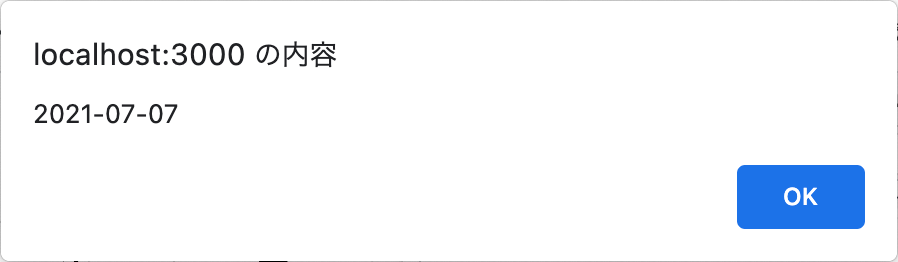
importしたinteractionPluginは、FullCalendarコンポーネントのpluginsに加えてください。用いるイベントはdateClickです。コールバックは、ReactのuseCallbackフックに定めた方がよいでしょう(「Create React App 入門 09: useCallbackフックで無駄な処理を省く」参照)。イベントハンドラが受け取る引数(arg)は、プラグインから読み込んだDateClickArgで型づけします。これで、カレンダーのクリックした日付が、警告ダイアログに示されるはずです(図003)。
src/App.test.tsximport { useCallback } from 'react'; import interactionPlugin, { DateClickArg } from '@fullcalendar/interaction'; function App() { const handleDateClick = useCallback((arg: DateClickArg) => { alert(arg.dateStr); }, []); return ( <FullCalendar // plugins={[dayGridPlugin]} plugins={[dayGridPlugin, interactionPlugin]} dateClick={handleDateClick} /> ); }
図003■カレンダーの日付をクリックすると開くダイアログ
05 コンテンツの差し込み
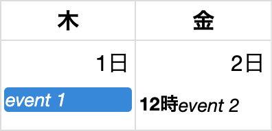
FullCalendarには、カスタマイズしたコンテンツを差し込めるAPIが備わっています。そのうちのひとつeventContentは、イベントの要素の中身を書き替えるフックです。コールバックを与えれば、返されたJSX要素がイベントとして差し込まれます(「Content Injection」参照)。関数が受け取る引数(eventContent)は、イベントの情報を収めたオブジェクトです。プロパティのtimeTextは時刻を示す文字列、eventからイベントオブジェクトが得られます。
src/App.test.tsx// import FullCalendar from '@fullcalendar/react'; import FullCalendar, { EventContentArg } from '@fullcalendar/react'; const renderEventContent = (eventInfo: EventContentArg) => ( <> <b>{eventInfo.timeText}</b> <i>{eventInfo.event.title}</i> </> ); function App() { return ( <FullCalendar eventContent={renderEventContent} /> ); }
カレンダーの日付セルに示されるイベント要素の表示が変わります(図004)。
図004■カレンダーの日付セルに示されるイベントの表示が変わった
06 FullCalendarユーティリティ
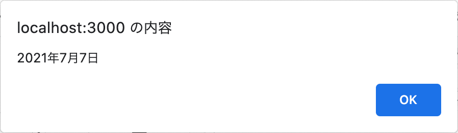
FullCalendarにはユーティリティが備わっています。その中で、日付を適切な書式の文字列に整えるのが、formatDate()関数です。第1引数に日付、第2引数には書式が定められたオブジェクトを渡してください(書式について詳しくは「Date Formatting」参照)。
src/App.test.tsx// import FullCalendar, { EventContentArg } from '@fullcalendar/react'; import FullCalendar, { EventContentArg, formatDate } from '@fullcalendar/react'; const getFormatDate = (date: Date) => formatDate(date, { month: 'long', year: 'numeric', day: 'numeric', locale: 'ja', }); function App() { const handleDateClick = useCallback((arg: DateClickArg) => { // alert(arg.dateStr); alert(getFormatDate(arg.date)); }, []); }
これで、カレンダーのセルをクリックしたとき、開くダイアログの日付が日本語表記になりました(図005)。ここまでのコードをまとめたのが、以下のサンプル002です。各モジュールのコード全体や具体的な動きについてはこちらでお確かめください。
図005■ダイアログの日付が日本語表記になった
サンプル002■React + TypeScript: FullCalendar with component 02
07 コンポーネントでビューを自作する
カレンダーのビューは自作できます。ビューはプラグインとして定めなければなりません。プラグインをつくって返す関数が、createPlugin()です。関数に渡す引数オブジェクトのviewsプロパティに、任意のビュー名(custom)でReactコンポーネント(CustomView)を収めます。そして、このコンポーネントの戻り値が、ビューを定めるJSX要素となるのです(コード001)。コンポーネントは引数(props)として、日付やイベントの情報が取り出せるオブジェクトを受け取ります。
コード001■カレンダーのビューを定めるコンポーネント
src/CustomView.tsx
import React from 'react';
import {
	sliceEvents,
	createPlugin,
	DateProfile,
	Duration,
	ViewProps,
} from '@fullcalendar/react';

const CustomView: React.VFC<
	ViewProps & { dateProfile: DateProfile; nextDayThreshold: Duration }
> = (props) => {
	const segs = sliceEvents(props);
	return (
		<>
			<div>{props.dateProfile.currentRange.start.toUTCString()}</div>
			<div>{segs.length} events</div>
		</>
	);
};

export default createPlugin({
	views: {
		custom: CustomView as React.VFC,
	},
});
親のルートモジュール(src/App.tsx)は、importしたプラグイン(customViewPlugin)をpluginsの配列に加えればよいのです。ビュー(custom)はinitialViewに定めるとともに、ヘッダーのボタンとしても加えました(「ヘッダーのタイトルやボタンをカスタマイズする」参照)。
src/App.test.tsximport customViewPlugin from './CustomView'; function App() { return ( <FullCalendar // plugins={[dayGridPlugin, interactionPlugin]} plugins={[dayGridPlugin, interactionPlugin, customViewPlugin]} // initialView="dayGridMonth" initialView="custom" headerToolbar={{ center: 'dayGridMonth,custom', }} /> ); }
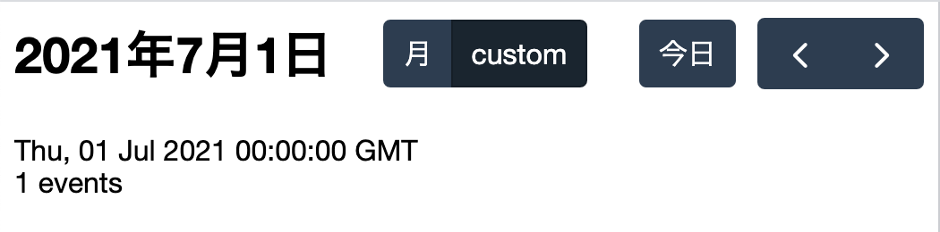
自作したビュー(custom)はあくまで簡単なテスト用です。日付単位で、その日のDateオブジェクトの文字列表現(Date.prototype.toUTCString())と、登録されているイベント数を示します(図006)。ヘッダー中央に加わったのが、月表示との切り替えボタンです。
図006■日付とイベント数を示す自作ビュー
08 Calendar API
FullCalendarコンポーネントからCalendarオブジェクトを参照して操作するのがCalendar APIです。たとえば、ビューにおける日付情報の取得や操作などができます(「Docs / Date Navigation」参照)。
このAPIを使うためには、まずuseRefフックでつくったrefオブジェクトを、FullCalendarコンポーネントのrefプロパティに与えてください。そのうえで、refオブジェクトのcurrentプロパティにgetApi()メソッドを呼び出して得られるのがCalendarコンポーネントインスタンスです。このオブジェクトに対して、APIが呼び出せるようになります。
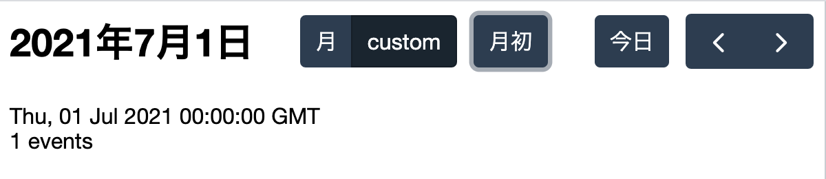
つぎのコードでは、customButtonsにボタンを定めて(customButton)、ヘッダー中央に加えました(図007)。日付単位のビュー(custom)で、月初(1日)に移動するボタンです。clickハンドラ(gotoFirstDay())は、APIで得たビューの表示日のDateオブジェクト(currentDate)に対して日を1にしたうえで、gotoDate()によりその月の1日に移動しています。
src/App.test.tsx// import { useCallback } from 'react'; import { useCallback, useRef } from 'react'; function App() { const calendarRef = useRef<FullCalendar>(null!); const gotoFirstDay = useCallback(() => { const calendarApi = calendarRef.current.getApi(); const currentDate = calendarApi.getDate(); currentDate.setDate(1); calendarApi.gotoDate(currentDate); }, []); return ( <FullCalendar ref={calendarRef} customButtons={{ customButton: { text: '月初', click: gotoFirstDay, }, }} headerToolbar={{ // center: 'dayGridMonth,custom', center: 'dayGridMonth,custom customButton', }} /> ); }
ノート01■useRefフックで初期値がnullのときの型指定と初期化
useRefフックに与える初期値がなかったり、決められないとき、型づけと引数については覚えておくとよいテクニックがあります。「React + TypeScript: useRefの3つの型指定と初期値の使い方」をお読みください。
図007■ヘッダー中央に月初に移動するボタンが加わった
ここまでのコードは、つぎのサンプル003としてCodeSandboxに公開します。また、ルートモジュールsrc/App.tsxの記述全体を、以下のコード002に掲げました。
サンプル003■React + TypeScript: FullCalendar with component 03
コード002■ルートモジュール
src/App.tsx
import { useCallback, useRef } from 'react';
import FullCalendar, { EventContentArg, formatDate } from '@fullcalendar/react';
import dayGridPlugin from '@fullcalendar/daygrid';
import allLocales from '@fullcalendar/core/locales-all';
import interactionPlugin, { DateClickArg } from '@fullcalendar/interaction';
import customViewPlugin from './CustomView';

const renderEventContent = (eventInfo: EventContentArg) => (
	<>
		<b>{eventInfo.timeText}</b>
		<i>{eventInfo.event.title}</i>
	</>
);
const getFormatDate = (date: Date) =>
	formatDate(date, {
		month: 'long',
		year: 'numeric',
		day: 'numeric',
		locale: 'ja',
	});
function App() {
	const calendarRef = useRef<FullCalendar>(null!);
	const handleDateClick = useCallback((arg: DateClickArg) => {
		alert(getFormatDate(arg.date));
	}, []);
	const gotoFirstDay = useCallback(() => {
		const calendarApi = calendarRef.current.getApi();
		const currentDate = calendarApi.getDate();
		currentDate.setDate(1);
		calendarApi.gotoDate(currentDate);
	}, []);
	return (
		<FullCalendar
			ref={calendarRef}
			plugins={[dayGridPlugin, interactionPlugin, customViewPlugin]}
			initialView="custom"
			customButtons={{
				customButton: {
					text: '月初',
					click: gotoFirstDay,
				},
			}}
			headerToolbar={{
				center: 'dayGridMonth,custom customButton',
			}}
			weekends={false}
			events={[
				{ title: 'event 1', start: '2021-07-01' },
				{ title: 'event 2', start: '2021-07-02T12:00:00' },
			]}
			locales={allLocales}
			locale="ja"
			eventContent={renderEventContent}
			dateClick={handleDateClick}
		/>
	);
}

export default App;
09 FullCalendar Premiumを使う
FullCalendarには、有償のPremiumライセンスもあります。提供されるのは、ビューの3つの追加プラグインとサポートです(「FullCalendar Pricing」参照)。その中から、タイムラインビューが表示できるプラグイン@fullcalendar/resource-timelineを試しましょう。標準ライセンスのプラグインと同じく、インストールしなければなりません。
npm install --save @fullcalendar/resource-timelineyarn add @fullcalendar/resource-timeline
そして、プラグイン(resourceTimelinePlugin)をpluginsに加えます。標準のビューのプラグインと違うのは、schedulerLicenseKeyにライセンスキーを登録しなければならないことです。もっとも、ライセンス購入前に試せるよう、「Free Trial」にお試し用のライセンスキーが提供されています。商用に使えないほかは、とくに機能の制限などはありません。
src/App.test.tsximport resourceTimelinePlugin from '@fullcalendar/resource-timeline'; function App() { return ( <FullCalendar schedulerLicenseKey="ライセンスキー" plugins={[ resourceTimelinePlugin ]} /> ); }
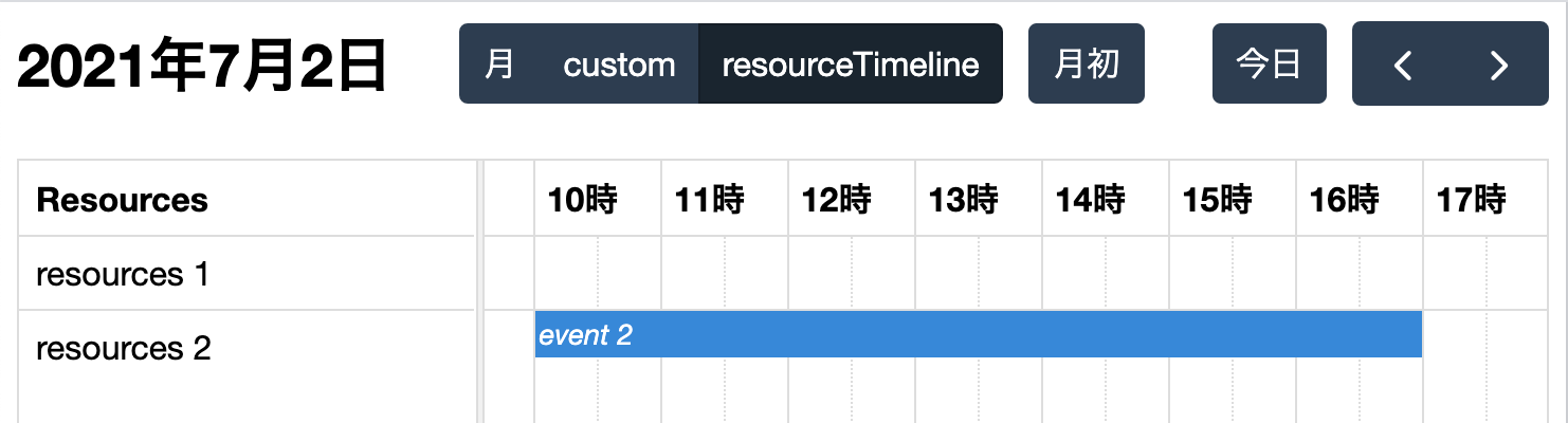
タイムラインビューの組み込み方は、標準のビューと同じです。タイムラインビューでは、時刻が水平軸になります。そして、縦軸のカラムに加わるのがリソースです。そのため、FullCalendarコンポーネントには、resourcesを配列で定めなければなりません(「Docs / Resource Data」参照)。各リソースにはidを与え、イベントのresourceIdに関連づけます(「Associating Events with Resources」参照)。すると、タイムラインビューには、リソースごとにイベントが時間軸に沿って示されるのです(図008)。
src/App.test.tsxfunction App() { return ( <FullCalendar // initialView="custom" initialView="resourceTimeline" headerToolbar={{ // center: 'dayGridMonth,custom customButton', center: 'dayGridMonth,custom,resourceTimeline customButton', }} resources={[ { id: '01', title: 'resources 1' }, { id: '02', title: 'resources 2' }, ]} events={[ // { title: 'event 1', start: '2021-07-01' }, { title: 'event 1', start: '2021-07-01', resourceId: '01' }, // { title: 'event 2', start: '2021-07-02T12:00:00' }, { title: 'event 2', start: '2021-07-02T10:00:00', end: '2021-07-02T17:00:00', resourceId: '02' }, ]} /> ); }
図008■resourceTimelineのビューが加わった
作成者: 野中文雄
作成日: 2021年07月31日
Copyright © 2001-2020 Fumio Nonaka. All rights reserved.